My List of the Best WordPress Website Designs of 2009
 ANNOUNCEMENT: The Best WordPress Design 2009 Contest launches Saturday, August 1st! Click here to learn more… ANNOUNCEMENT: The Best WordPress Design 2009 Contest launches Saturday, August 1st! Click here to learn more…
|
 I’m a sucker for a cool web design and lately a few have really caught my eye. Whether it’s the color scheme, graphics or layout, some web designs simply rock and make you want to learn more about the owner or company.
As many of you know, WordPress is a free publishing platform that thousands of bloggers use worldwide. What you may not know is WordPress has become one of the best web design tools available and has advanced past simply being a blogger’s best friend. You don’t need a blog to use WordPress. Any type of website can be powered by WP.
The following list is made up of websites powered (or driven) by WordPress. What you should notice is not all of them are blogs, though many of them have blogs. Quite a few are just normal websites that sell products or services. But, each is built on a WordPress platform.
Top Secret Women’s Business
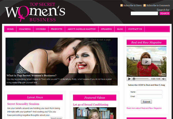
Ok, I might be a little biased with this one because I LOVE PINK & BLACK! But, beyond my love for the color scheme, what kicks butt about this design is the fact that you know immediately who this website is for – Women! Every detail speaks to its target market, from the Georgia font to the female symbol in the logo. The design is loud and yet soft. It sparks excitement and burns its brand into your mind.
Top Secret Women’s Business actually uses StudioPress’s Metro Premium WordPress Theme. They simply customized it by adjusting the colors.
KICK BUTT WEB DESIGN FACTORS: Clean, Market Specific, Not Afraid of Color, Brand Focused
PLATFORM: WordPress 2.7.1
WEBSITE: TopSecretWomensBusiness.com
StudioPress
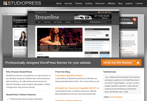
Speaking of Premium WordPress themes, there’s no way I could leave StudioPress’s design off this list. StudioPress is actually where I purchased the skeleton theme for FresheVenture.com (their Lifestyle theme). I have had a long love affair with their themes as well as their own website design.
Their design is what I call a “makes you want to click a button” design. It practically leaps off the screen and entices you to read, click and purchase. It’s incredibly easy to navigate and actually helps walk you through the purchase process (a sign of a well designed website). It’s hard not to purchase one of their themes when you see what awesome web design work they provide!
KICK BUTT WEB DESIGN FACTORS: Clean, Makes You Want to Click a Button, Call to Action Supported
PLATFORM: WordPress 2.7.1
WEBSITE: StudioPress.com
BuddyPress
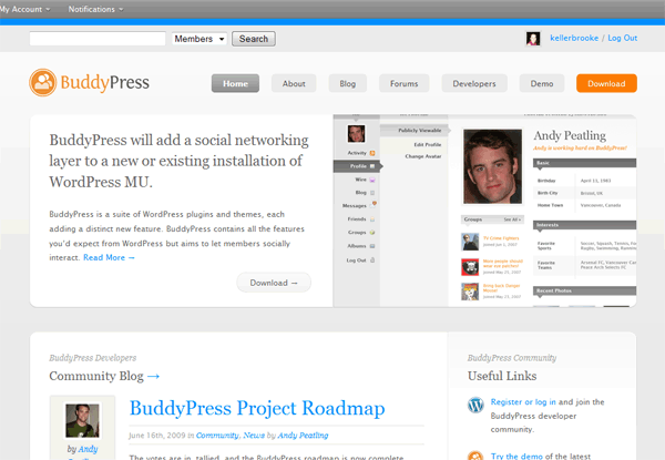
I’ve recently become acquainted with BuddyPress as one of my websites (currently under development) utilizes its WordPress plugin. BuddyPress offers a social network platform for WordPress MU users. WordPress MU is the multi-blog WP platform (you get to run multiple blogs from the same installation). BuddyPress allows you to create a social network on your website where users can “friend” each other, create and join groups, create blogs and more!
BuddyPress’s design is incredibly clean and well laid out. Each element is separated by some background space, which helps separate content. I’ve never seen a web design quite like it.
One of my favorite design aspects of BuddyPress is the rounded corners. I don’t know why, but I really like them!
The BuddyPress website has A LOT of content, which means it requires a design that supports the size of the site and helps to NOT overwhelm visitors. I think they’ve done just that!
KICK BUTT WEB DESIGN FACTORS: Clean, Call to Action Supported, Brand Focused
PLATFORM: WordPress 2.7.1
WEBSITE: BuddyPress.org
Disqus
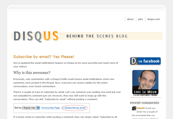
Ok, this is probably the simplest design on my list and that’s exactly why I chose it. I love Disqus’ use of white space! So often, pale or light colors wash out a website or put off a boring vibe. Well, not with this one!
It’s clean, easy to read and pleasing to the eye. It’s simple to navigate and in no way intimidates the reader.
Just in case you don’t know, Disqus is an awesome commenting system that can be used for WordPress sites (FresheVenture.com uses Disqus).
KICK BUTT WEB DESIGN FACTORS: Clean, White Space Used Effectively, Understandable Layout
PLATFORM: WordPress 2.6.3
WEBSITE: Blog.Disqus.net
Affiliate Theme
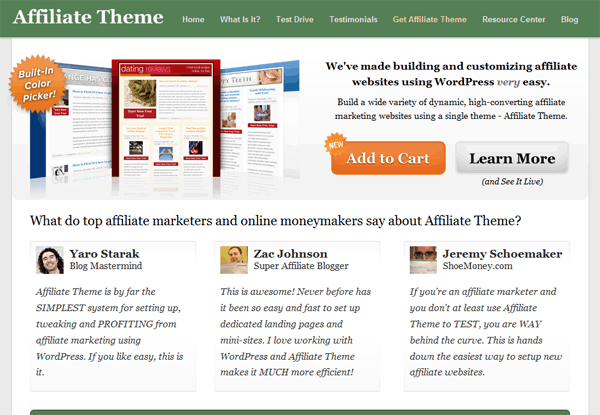
This is one of my favorites out of all my, well favorites!!! The second I saw this design, I actually began revamping some of FresheVenture.com’s design elements (particularly my newsletter sign up button).
I love the size, layout and call to action graphics of this design. It’s SIMPLE and yet POWERFUL. The large buttons help move visitors through the purchase process. The testimonials are laid out in the first fold of the website, helping to support their call to action. Even though they are selling a product, they haven’t created a long sales letter type home page. Instead, they’ve kept it short and sweet.
The navigation is laid out in perfect order (Step One: What, Step Two: How, Step Three: Who, etc). I even love the font (I think it’s Georgia). The impression I get is a modern Web 2.0 website with a touch of traditional design. Very classy, very attractive, very “makes you want to click a button!”
Affiliate Theme is a Premium WordPress theme creator that goes 10 steps forward by providing a powerful backend design management tool. Very cool for affiliates who use WordPress!
KICK BUTT WEB DESIGN FACTORS: Clean, White Space Used Effectively, Understandable Layout, Call to Action Supported
PLATFORM: WordPress 2.7.1
WEBSITE: AffiliateTheme.net
CopyBlogger
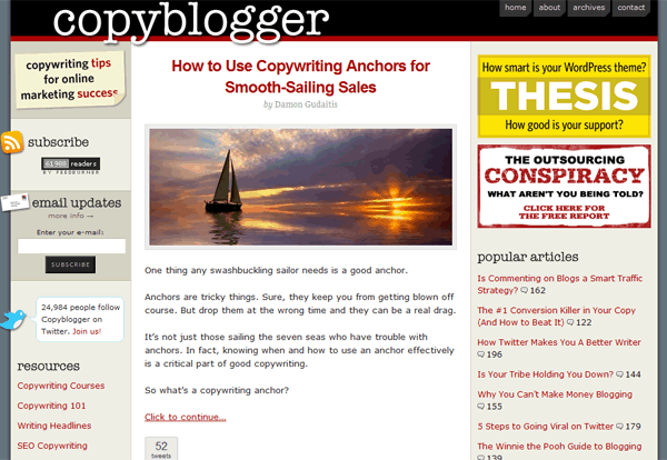
If you’ve never visited CopyBlogger, I highly suggest you check them out asap. Talk about fantastic online marketing content. It’s one of my favorite Internet marketing resources!
But beyond its great content, CopyBlogger has a pretty cool design. It uses the premium WordPress theme Thesis, which was customized by Chris Pearson.
The design supports the purpose of the website – the content is easy to find, easy to view and easy to manage (rss, twitter, comments).
My favorite part of this design actually only takes up a small part of the website. It’s the little graphic elements in the left sidebar – the sticky note, envelope and bird. They overlap onto the background making each element seem as through you could pick it up with your fingers. Very cool!
KICK BUTT WEB DESIGN FACTORS: Clean, Understandable Layout, Call to Action Supported
PLATFORM: Unsure
WEBSITE: CopyBlogger.com
Sugarrae
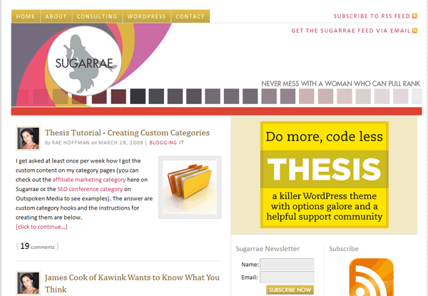
Yet another Thesis themed WordPress site! I LOVE the color scheme and layout of this design. The call to actions for the newsletter and RSS subscriptions are well placed and everything seems to have its own happy little home.
Even though there is a lot of information in the right sidebars, it’s easy to navigate due to the crisp white background and use of white space. It’s modern, cool and inviting. Makes me want to find out more about this Sugarrae!
KICK BUTT WEB DESIGN FACTORS: Clean, White Space Used Effectively, Understandable Layout, Call to Action Supported
PLATFORM: Unsure of Version
WEBSITE: Sugarrae.com
Blog Tech Guy
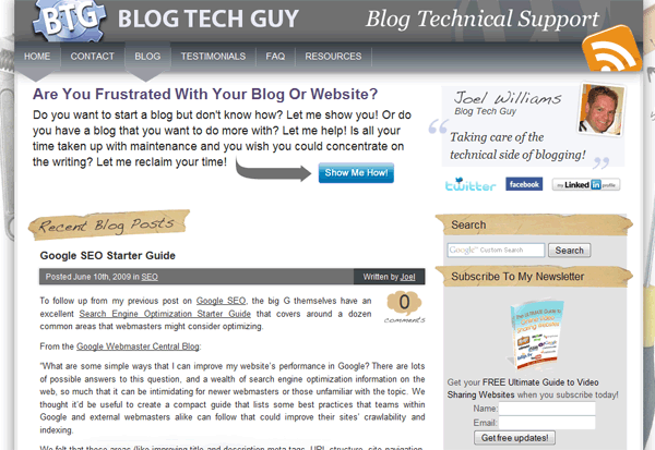
I actually know Joel (the Blog Tech Guy) from my membership with Blog Mastermind. He provides consulting and development services for WordPress and is a heck of a nice guy!
There are several aspects of his design that I love. I think the most important is his header. If you click through to different pages, you will notice that the main call to action (“Are You Frustrated” area) and the social links with his photo are actually part of his header. They are displayed on every page – a VERY wise move to help push his call to action.
With the mix of natural elements (parchment and notebook paper) and tools (wrench and rulers in background), his brand is well defined.
His design jumps off the monitor with his use of shading, which helps make the website appear to be a piece of paper or flyer. I also really like the footer. It’s been separated from the rest of the design, helping visitors to navigate information easily.
KICK BUTT WEB DESIGN FACTORS: Clean, Call to Action Supported, Brand Focused
PLATFORM: WordPress 2.8
WEBSITE: BlogTechGuy.com
What They Each Have In Common
Did you notice my “Kick Butt Web Design Factors?” Well if you did, you saw that every one of these designs scored points for being CLEAN and many scored points for being BRAND FOCUSED, MARKET SPECIFIC and CALL TO ACTION SUPPORTED. These are incredibly important and powerful factors that can make or break a website.
Even though your website is just that – yours – it MUST be designed for your audience and it must support your call to action. If you need people to sign up for your newsletter, purchase your product or read your content, your web design should gently force those actions. It’s not all about colors and crazy graphics – it’s also about layout, navigation and ease of use.
If you aren’t currently using WordPress to publish your website, I recommend you do so.
Did I Miss a Cool Design?
In the comments section below, tell me which WordPress driven website designs you love the most and why. I WILL add more to this list and yours may be one!
Topic Tags:
best web design, blog design, internet marketing, target market, web design, website layout, wordpress



 I’m Keller Hawthorne, Founder of FresheVenture.com. Whether you’re new to the world of Internet Marketing or already have your own Internet Business, I’m here to help you make a living online!
 Subscribe to My RSS Feed!